INDUSTRY:
FinTech
CLIENT:
Hitachi DSS
YEAR:
2024
EXPERIENCE:
Product & Business Design

Hitachi DSS
about.
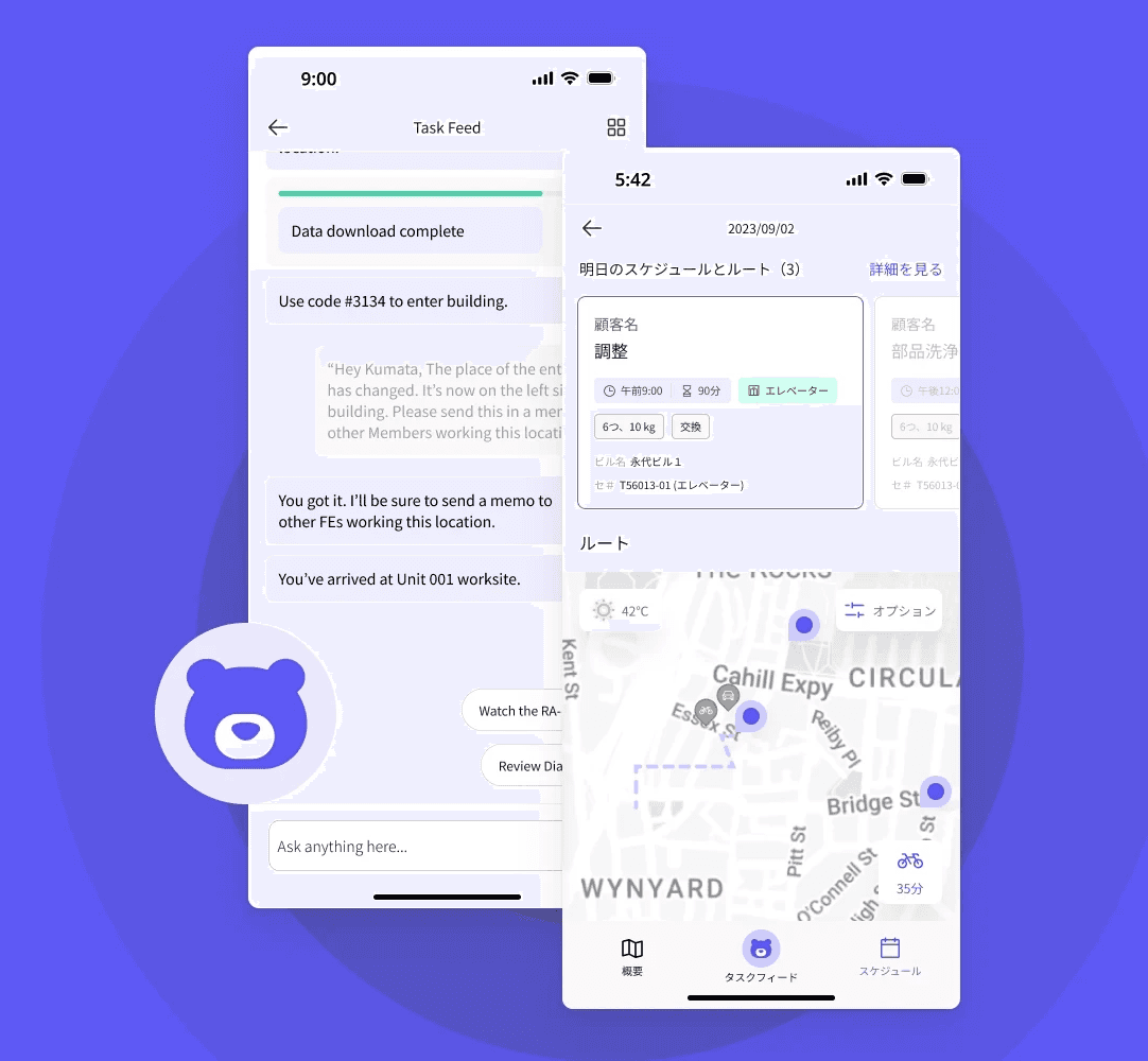
Hitachi’s Digital Systems & Services Unit (DSS) required a more effective way to deliver critical financial data to its executive team. Monthly, quarterly, and yearly reports were slow, hard to digest, and lacked personalization.
I led the visual direction and UX design for a mobile-first dashboard that empowers C-suite executives to make faster, data-driven decisions.
challenge.
Executive reporting at a crawl
Hitachi DSS executives were receiving dense financial reports that were time-consuming to process and hard to act on quickly. These reports often lacked context, clarity, and mobility — especially during high-stakes meetings or travel. The team needed a tool that could surface high-level insights at a glance, while still offering drill-down depth when needed.
solution.
Create an easy-to-use tool that provides personalized, high-level financial insights to executives in a clear and concise way.
requirements & research
Understanding C-Suite Needs
I conducted interviews with senior executives across the organization to gain an understanding of their current workflows, pain points, and priorities.
Common themes included:
Time wasted searching for relevant figures in large reports
Data views not tailored to their business unit
No mobile access during travel or board meetings


deliverables.
Based on research, I organized the dashboard around key priorities:
Quick-view KPIs
Personalized filters per executive role
Drill-down capability for deeper reporting
Clean, intuitive UI designed for mobile-first access
The dashboard enables executives to act on critical data in minutes, not hours. The solution supports better decision-making during board meetings, travel, and strategic planning.


more to explore.

about.
Hitachi’s Digital Systems & Services Unit (DSS) needed a better way to deliver critical financial data to its executive team. Monthly, quarterly, and yearly reports were slow, hard to digest, and lacked personalization.
I led the visual direction and UX design of a mobile dashboard tailored to the needs of C-suite users. The product is set to launch in 2025.
challenge.
Executive reporting at a crawl
Hitachi DSS executives were receiving dense financial reports that were time-consuming to process and hard to act on quickly. These reports often lacked context, clarity, and mobility — especially during high-stakes meetings or travel. The team needed a tool that could surface high-level insights at a glance, while still offering drill-down depth when needed.
research & insights.
Understanding C-Suite Needs
I conducted interviews with senior executives across the organization to gain an understanding of their current workflows, pain points, and priorities.
Common themes included:
Wasting time searching for relevant figures in large reports
Needing data views tailored to their business unit
Desire for mobile access during travel or board meetings
solution.
Based on research, I organized the dashboard around key priorities:
Quick-view KPIs
Personalized filters per executive role
Drill-down capability for deeper reporting
Clean, intuitive UI designed for mobile-first access
I explored several layout directions before settling on a minimal, high-contrast design that emphasized scannability and consistency.